Written from the field by Senior Project Engineer Oliver Port
How live data is giving operators a clearer view of their pipeline
The last blog shared how a leak on a rising sewer main was first detected through pressure data and later confirmed when a valve pit overflowed. That case showed how important it is to close the loop between monitoring and field evidence.


Figure 1 Example user interface
 Detecting leaks is vital, but operators also need day-to-day insight into how their pipelines behave. That’s where the work I’ve been doing recently comes in: setting up a web-based tool that turns Atmos Sentinel and Aquarius data into clear, accessible trends. Figure 1 gives two examples of the user interface indicating the pipeline and instrument location on a map.
Instead of raw numbers, operators see pressure and flow presented in a way that makes sense for their operations.
Building coverage on critical rising sewer mains
Starting in the UK with our first installation of Atmos Sentinel followed by a second in a chamber (see Figure 2), together these units gave full monitoring of the rising main.
Even with the heavy chamber cover in place, data came through reliably over 4G. On Atmos Aqua Insight, this data is displayed as simple charts showing peak-to-peak pressure and average pressure in five-minute blocks (see Figure 3).
Figure 2: Atmos Sentinel installed on a process connection within a chamber
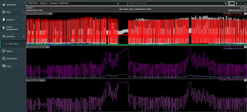
Figure 3: The data from both Atmos Sentinel units within Atmos Aqua Insight. The top chart shows peak-to-peak pressure, the middle chart shows the average pressure and the bottom chart shows derived flow for each five-minute block of data.
Expanding the scope
Following the initial success, I installed another Atmos Sentinel unit at a pumping station in the UK so we were able to monitor three rising sewer mains at real-time. Alongside pressure data, Atmos Sentinel units also provide flow readings, all provided in a user-friendly view on the web GUI (see Figure 4).


Figure 4: Atmos Sentinel installed on a process connection within the chamber, with the 4G antenna mounted directly onto the unit even with the large metal cover in place (left). Similar to Figure 3, the right chart shows peak-to-peak pressure (top), average pressure (middle) and a flow reading derived from the Atmos Sentinel unit (bottom).
When the data shows more than expected
After installing another Atmos Sentinel on a rising sewer main, within a week the data revealed an unusual pattern during shut-in periods: pressure was dropping faster than normal. Although we flagged it as a potential leak, the leak resealed.
I discussed in my previous blog that this is a common occurrence in wastewater pipelines, but the point is that it was picked up almost immediately by the web GUI.

Figure 5: 30 hours of data from Atmos Aqua Insight. The top chart shows peak-to-peak pressure data and the bottom trend shows the rate of pressure drop during shut-in. On the left side of the graphs, a higher rate of pressure drop can be seen during two shut-in periods, indicating a potential leak.
From the UK to Italy: testing abroad
Most recently I supported our partner Aquanexa in Italy, installing two flow units on local utility pipelines. The units streamed data live to the web GUI from the moment they were installed.
Lessons from the field
These projects have shown how quality field data becomes operational insight. Pressure and flow aren’t just numbers on a chart, they provide information that operators can use to understand their pipeline behavior, spot problems early and run their systems with confidence.
That’s the real value of being in the field: making sure what we install doesn’t just work, but that it gives people information they can act on.